Santa Monica, California
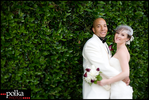
I’m finishing up editing photos from Mackenzie and Allan’s beautiful wedding. Don’t they make a gorgeous couple?


|
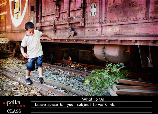
My friend Michele is walking in the 3-Day for the Cure in honor of one of her best friends. To show my support of Michele and the 3-Day, Polka Pin-Ups is offering mini-sessions with all profits going toward Michele’s fundraising. Book soon before the spots are all gone! WHAT: 1-2 hr boudoir session WHEN: Sat. May 22 WHERE: Chicago Northwest Suburbs WHY: To have fun and support a great cause! HOW MUCH: $200 with 50% donated toward Michele’s fundraising   Composition Lesson 4: Rule of Space Let’s discuss space. When taking a photo, you make a decision how much space is around your subject. In Week 1, the idea was to get close to your subject and have a clean background – so not a lot of space. Last week you used the rule of thirds to compose your images. Many of you chose to show your subject in a wide shot, incorporating the background into your photo. The rule of space can be applied to both tight or close-up photos of your subject and wide photos. This rule is all about leaving lead room. If your subject is looking to the side, there should be some space left in the direction he’s looking. The rule of space is a similar concept to negative space, but it refers only to the space between where the subject is looking or moving towards and the edge of the frame. If you’re taking photos of a moving subject, whether it be a toddler, puppy, jogger or car, you should leave room in front of the subject. A moving subject needs space in the direction he’s moving. This rule is more obvious when used with a subject moving horizontally or vertically in the frame. (The concept is more obscure if applied when the subject is moving toward or away from the photographer.) So for this week’s assignment, take photos of something moving from right to left, or left to right. Your subject doesn’t have to move fast. But if he is and you’re using manual settings, make sure your speed is high enough so as not to get motion blur.       For those of you who missed out on the class but still want to follow along, here’s another basic composition guideline. Composition Lesson 3: Rule of Thirds This week’s rule is found in all visual arts from painting to movies. I was watching last week’s Lost episode and kept noticing the rule of thirds being used during Desmond and Penny’s meeting in the stadium. Simply stated, this rule is about placing your points of interest 1/3 into the frame. The ideal placement is about 1/3 of the way both horizontally and vertically. If you imagine a picture separated by 4 lines, the ideal placement is then close to those 4 line intersections. Two mini rules that make this easier: 1. Place your horizon at the bottom third or top third line. For assignment purposes, follow one or both of the mini rules. I placed 1/3 lines in some of my examples but you don’t need to do that. The rule is just an approximation – you don’t need to have your focal point exactly at the intersection point. For examples, here are some photos from an engagement portrait session.   I purposefully placed the couple in the center of the photo below. Their serious expressions are reinforced by the almost unsettling symmetry in the composition.
    Here’s a landscape shot for variety.  
Laguna Beach, California
Erica and Michael came all the way from Atlanta for their engagement portrait session. (Well they really came for Mackenzie and Allan’s wedding, and decided it was also the perfect time for an engagement shoot.) Erica grew up in Orange County and wanted their photos on the beach for a California look.
  Nothing says California like palm trees.
  Although I love the blue sky, I wanted some of the photos to have a more unique look. It’s California, with a vintage twist.
  Found the cutest little beach.
  The rock formations made a perfect frame.
  Color or black & white – which do you prefer?   We walked around the city for some more shots.
  Serious…
  Fun…
  … and Sexy.
  There’s a Diamond Street!
    Finished the day at Heisler Park Beach.
  Can’t decide between these two hand-holding shots.
  The setting sun made for a dramatic silhouette.
  Thank you Erica and Michael for a fun session!
  |
|
Anonymous - lovely pictures!!
i cant wait to see more.