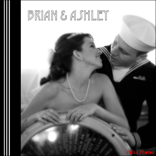
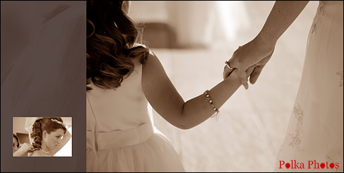
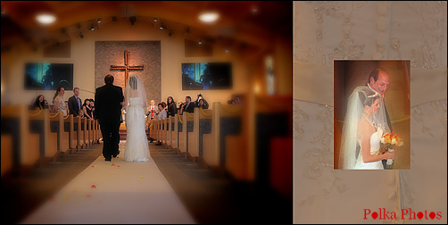
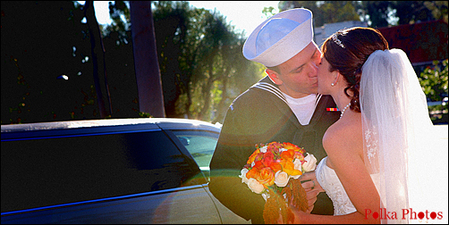
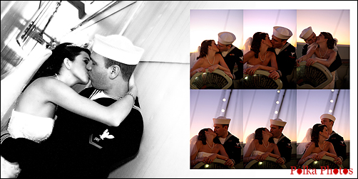
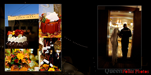
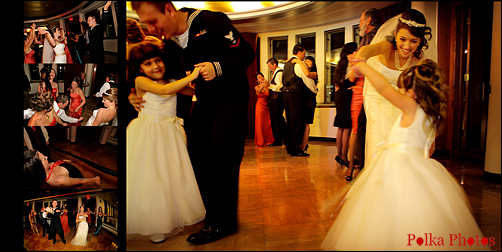
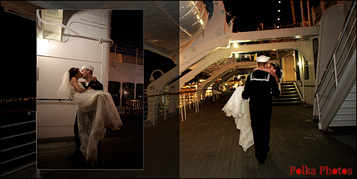
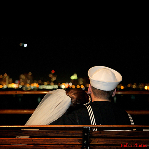
Playa del Rey, CaliforniaLately I've been working on some album designs and thought I'd share a few pages with you. Newlyweds Ashley and Brian had a beautiful church wedding followed by a reception on the
Queen Mary in Long Beach. I'm designing a 10 X 10 album for them using many panoramic spreads across two pages.
One of the hardest things for me is telling the story of the wedding concisely. My favorite albums have between 50 - 75 images. The rule of thumb for great album design is to use on average 2 to 3 photos per page, or 4 to 6 per spread. Since I shoot a lot of photojournalism style images, there are many photos of great moments. My final edit from an entire wedding is usually 600 - 800 images. It's challenging to edit them into a group that is strong from an artistic standpoint but also one that best illustrates the events of the wedding day. I also have a personal preference for using strong photos as stand-alone images.
So here's a rough draft of some of the pages. (And in case you're wondering, my logo is not printed on the wedding album pages, just here on the blog.) So what do you think? What are your preferences in album design?
Labels: album, wedding
